Modifying the Initial Dashboard in Microsoft Dynamics 365 for Operations
Some of the more confusing development changes in Dynamics 365 for Operations are around how the navigation elements are put together. In this blog, I’ll describe how to modify the initial dashboard displayed in Dynamics 365 for Operations. If you're a Dynamics 365 CRM user, check out this article on how to set up and customize your personal Dynamics 365 dashboard.
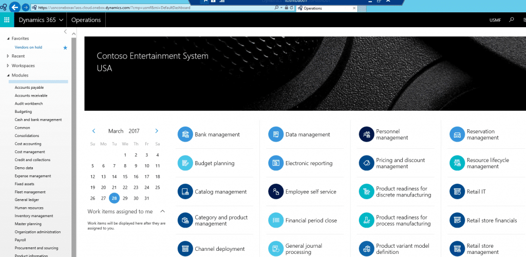
In D365 the first page displayed to the user is their dashboard. The dashboard consists of a bunch of buttons like Bank management, Budget planning, etc. For the system administrator who has access to everything in the system the dashboard looks like this:
In the Application Explorer, the dashboard is a menu, specifically the NavPaneMenu. The NavPaneMenu is like a standard menu in that it consists of submenus and menu items. It is different from other menus in that every menu item consists of a tile control pointing to a workspace. The workspaces used by the tile controls act as the entry points for modules.
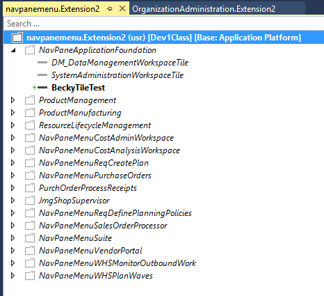
Below is an extension I have created to the NavPaneMenu. In my extension, I have added a tile control called BeckyTileTest.
At runtime, your tile control will be displayed on the dashboard in alphabetical order using the label assigned to the tile control. The BeckyTileTest added to my dashboard has a label of Testing.
Under the terms of this license, you are authorized to share and redistribute the content across various mediums, subject to adherence to the specified conditions: you must provide proper attribution to Stoneridge as the original creator in a manner that does not imply their endorsement of your use, the material is to be utilized solely for non-commercial purposes, and alterations, modifications, or derivative works based on the original material are strictly prohibited.
Responsibility rests with the licensee to ensure that their use of the material does not violate any other rights.


