


New Features in Dynamics 365 (CRM) Business Central – UI Improvements Overview
The Dynamics 365 (CRM) Business Central has a new and improved user interface (UI). Which is not to be confused with the new Unified Interface (also abbreviated UI) aka Unified Client Interface (UCI) – yes there are too many acronyms! Before we discuss the general User Interface improvements lets cover the key benefits of the new Unified Interface.
Overview of the Unified Interface:
- Streamlined navigation: going directly to the content that matters to the end user
- Consistent navigation across all devices: Web, Mobile, and Outlook
- Responsive Design: the layout and interface will adapt to the size of your screen
- Ease of use for keyboard users as well as touch-friendly interface
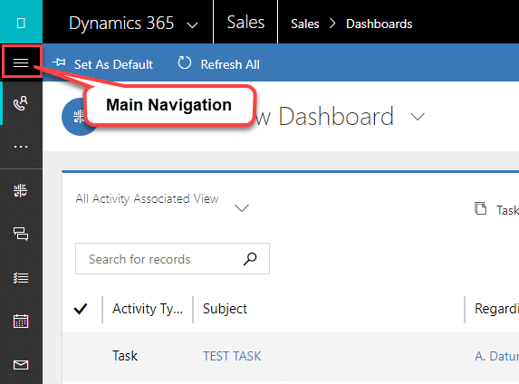
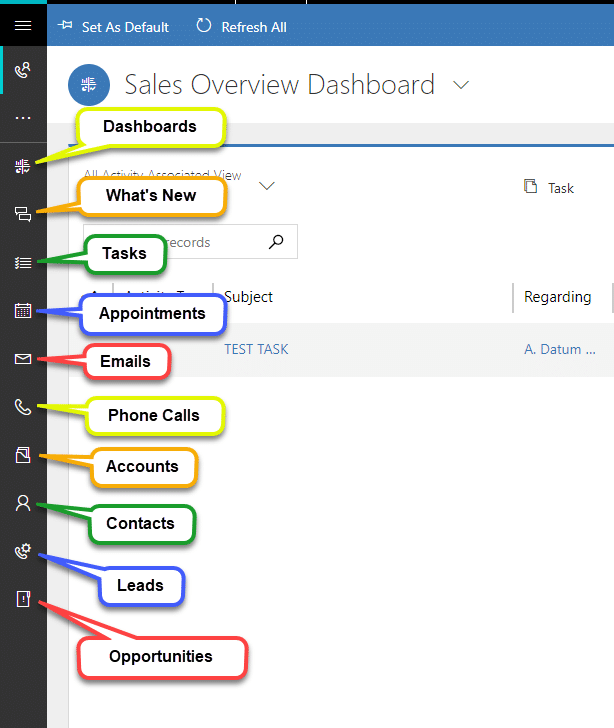
You’ll notice that in the Business Edition Sales App that Microsoft has re-introduced the concept of left navigation. The hamburger menu on the top left opens a navigation pane. There are also quick links to commonly used sales entities down the left-hand side of the screen.
Main Navigation
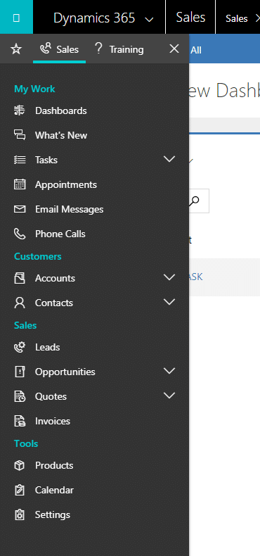
Quick Links
It seems that Microsoft has found a happy medium between “too much” white space that we were familiar with in CRM versions 2013, 2015 and 2016 and the very boxy and tabular versions of 4.0 and 2011. This new version has tabs, sections and fields are very clearly distinguished while still have a modern and user-friendly interface. This will definitely improve usability.
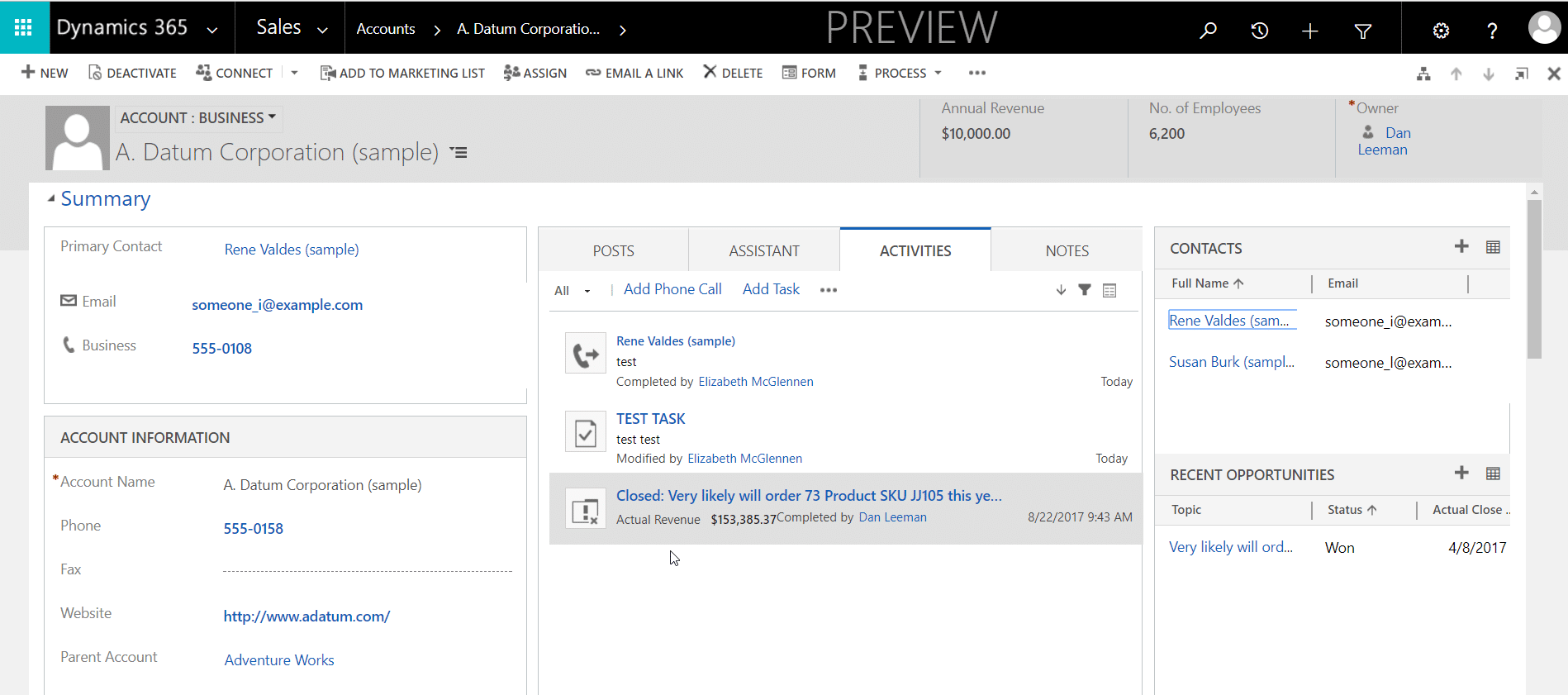
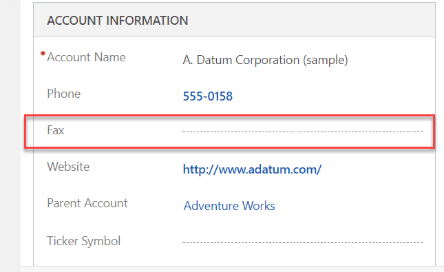
Microsoft has improved the indication that shows that the field is blank. Previously it was just two small dashes, which could easily go unnoticed. The two dashes also didn’t give the user an idea of how wide the field was. I’ve seen this cause some confusion with users about where to click to add data to the field. Now there are dashes the entire width of the field – again improving usability!
Another nice UI change that I noticed was the text in the header fields no longer trails off now it wraps so that all of the content is eligible.
In the Previous Version:

In the New Version:

Overall, the Dynamics 365 (CRM) Business Edition is modern and easy to use no matter which device you’re on. Stay tuned for more posts features and improvements in my Dynamics 365 Business Edition series!

Under the terms of this license, you are authorized to share and redistribute the content across various mediums, subject to adherence to the specified conditions: you must provide proper attribution to Stoneridge as the original creator in a manner that does not imply their endorsement of your use, the material is to be utilized solely for non-commercial purposes, and alterations, modifications, or derivative works based on the original material are strictly prohibited.
Responsibility rests with the licensee to ensure that their use of the material does not violate any other rights.