Power BI Basics: Turn Data into Actionable Insights
Using Power BI to analyze your data and share insights can revolutionize the way you create and publish detailed reports and interactive visualizations.
In this blog, we will dive into key features and functionalities of Power BI and how you can use it to enhance your business intelligence capabilities.
What is Power BI?
Power BI is a suite of business analytics tools that allow you to create visualizations, dashboards, and reports with self-service business intelligence capabilities.
It connects to a wide range of data sources and transforms data into actionable insights. You can then share these insights across your organization by creating your reports and dashboards.
It also offers robust data exploration, transformation, and visualization capabilities. Users can access Power BI via Windows desktop, online SaaS, or on a mobile app.
Core Components of Power BI
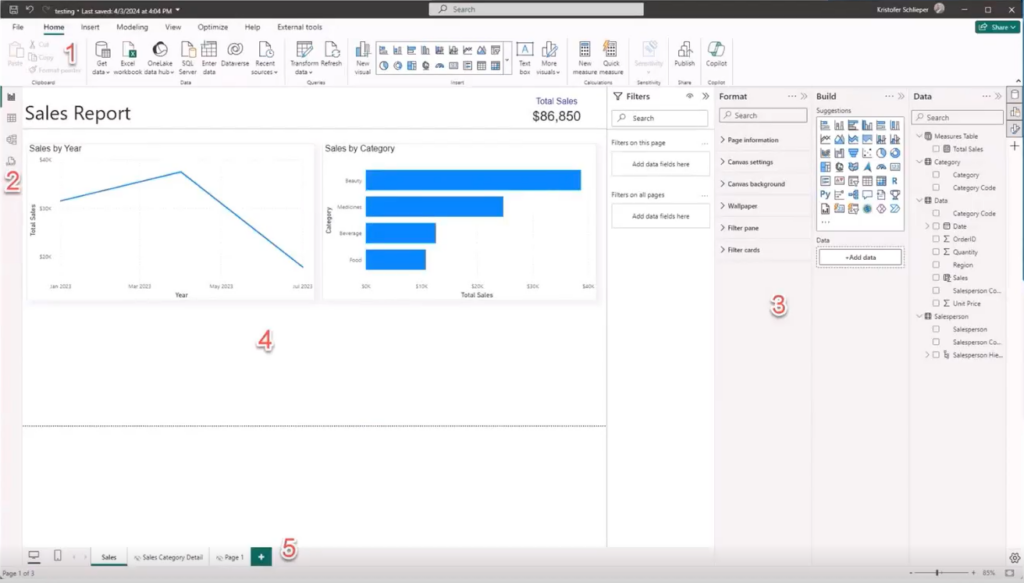
Power BI is easy to use and comes with a user-friendly interface. However, before you go on to create a report, you should familiarize yourself with the five core components that make up your Power BI dashboard.
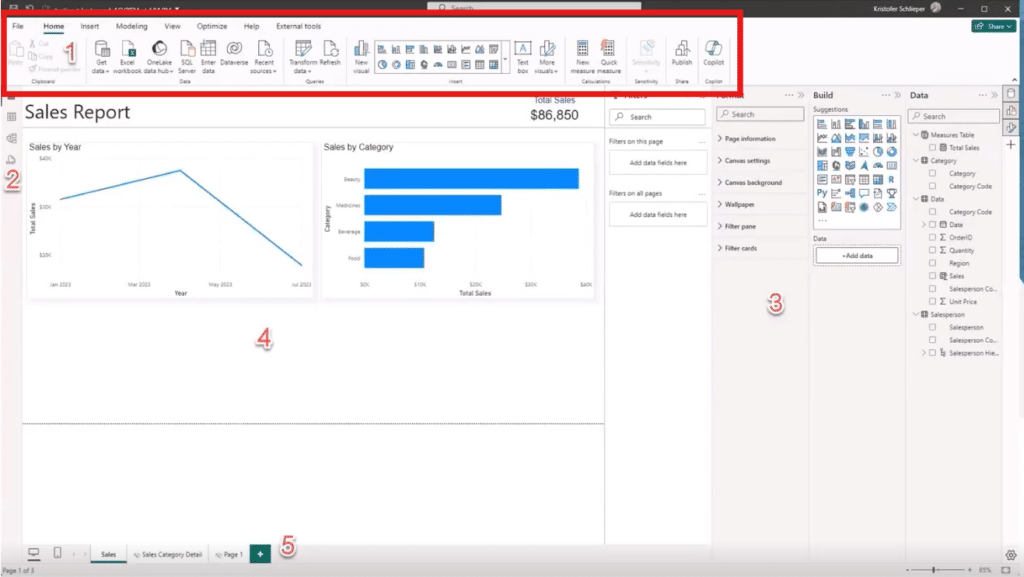
1. The Ribbon
Located in the upper left corner, the ribbon should be familiar to anyone who has used Microsoft products like Excel, Word, or Outlook. It groups command functionalities into tabs like Home, Insert, and Modelling. The Home tab is where you'll spend most of your time, while the Insert tab allows you to add various items, and the Modelling tab is for connecting and preparing your data for presentation.
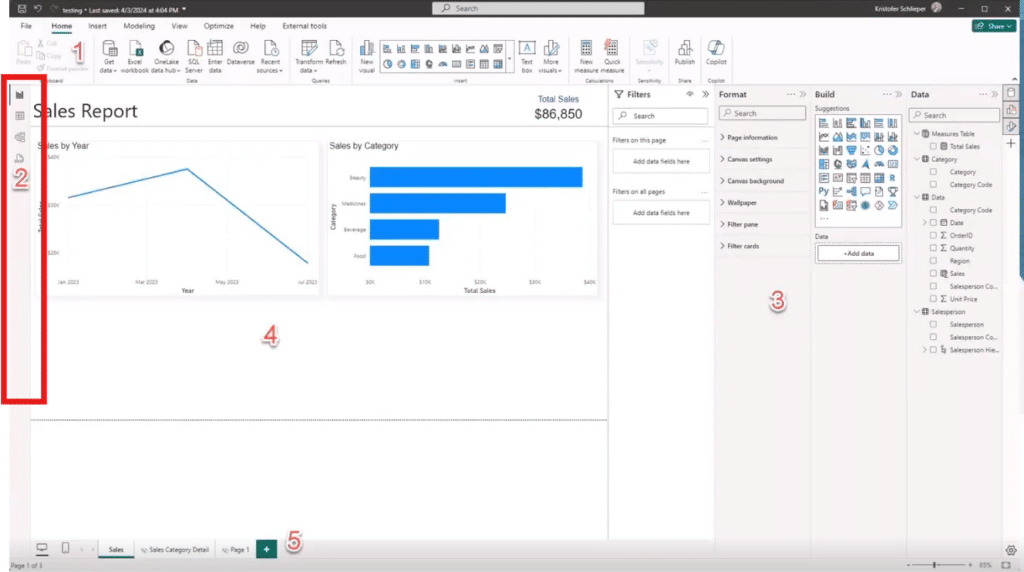
2. Views
On the left side of the interface, you'll find different views – Report view, Data view, Model view, and the recently released DAX view. These views allow you to switch the working area to focus on different aspects of your project:
- Report View: This is the main view where you create and manage your reports.
- Data View: Here, you can see your tables and the columns within them.
- Model View: This view is for managing relationships between multiple tables to create a more robust data model.
- DAX View: This new view provides a cleaner space to create DAX measures (Data Analytics Expressions), which enhance your data analysis with custom calculations like sums or averages.
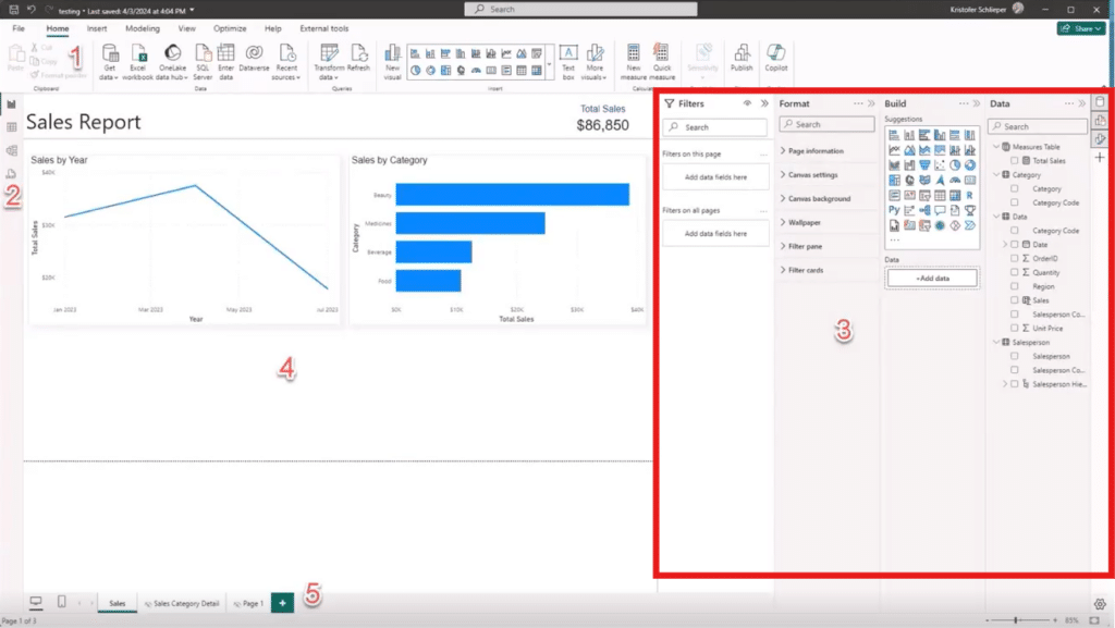
3. Panes
On the right-hand side of your screen, there are panes where you can control a variety of aspects of your Power BI dashboard. They include:
Field or Data Pane
The Field pane (or Data pane in some versions of Power BI Desktop) is where you see all of the data you are bringing in for your Power BI report.
Filtering Pane
On the right-hand side of your Power BI home screen, you can see the filtering pane. These are broken down into filtering on a visual, filtering on the page, or filtering the whole dashboard. Within the filters you can use advanced and basic filters which can include dates, times, or the number of records you want to show, just to name a few.
Building Pane
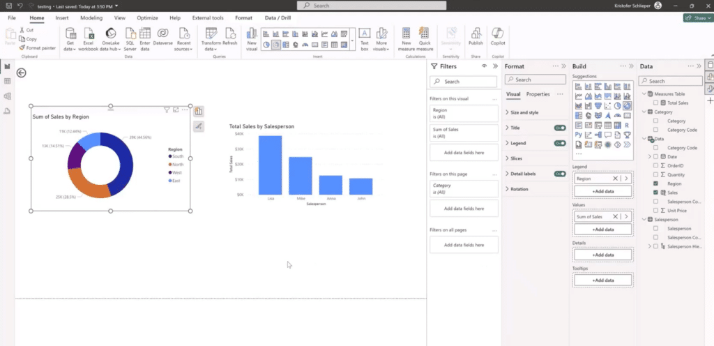
In this pane, you can select the type of visual you want to create and customize it by adding fields to the different sections that the visual allows.
Format Pane
The format pane is used to format and customize the look and feel of your overall report or dashboard. You can make formatting changes to the:
- Page size
- Background
- Page alignment
- Wallpaper
- Colors
- Layout
- And more
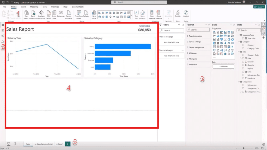
4. Working Area
The working area is where you can see your views. Depending on what type of view you have selected, that’s what you will see in this area. This is the presentation area where what you create here will be seen by your audience in the published report/dashboard.
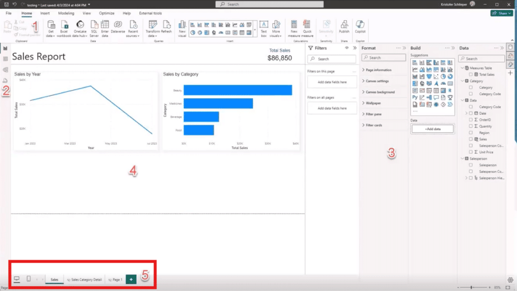
5. Pages
At the bottom of your main screen, you can manage and view the different pages of your report. Each page can contain multiple visualizations. This section functions similarly to Tabs in Excel.
Key Capabilities in Power BI
Now that you have an understanding of the components that make Power BI tick, you can dig into some specific features. Let’s take a look at some of the core features and functionalities in Power BI that enhance data analysis.
Interactive Visualizations
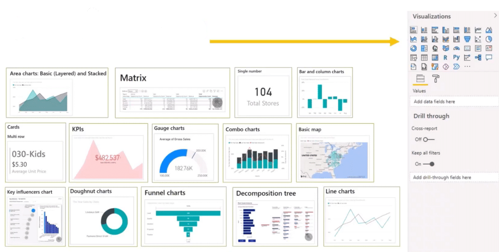
Users can create a variety of visualizations such as bar charts, pie charts, and line graphs. Visuals are interactive, allowing users to drill through data for deeper analysis.
Data Transformation
Power Query allows users to clean, transform, and mash-up data from multiple sources. Features such as filtering, grouping, and merging datasets streamline the data preparation process.
Dashboards and Reports
Dashboards provide a 360-degree view for business users with their most important metrics in one place. Reports are more detailed and can contain multiple pages with various visuals and data.
Natural Language Queries
The Q&A feature enables users to ask questions about their data in natural language and receive answers in the form of visuals.
How to Create a Power BI Report: Follow These Steps
Creating your first report in Power BI involves several steps, but the process is intuitive and user-friendly. Here's a high-level overview:
1. Connect to the Data Sources You Want to Use
Power BI supports a wide range of data sources. Whether you are pulling data from an Excel spreadsheet, a cloud service, or a database, the process is straightforward. You can connect to your data source directly within Power BI Desktop.
2. Prepare Your Data
Once connected, you can prepare your data in Power Query. This involves cleaning and transforming the data to ensure it is ready for analysis. Power BI provides tools to handle tasks such as removing duplicates, filtering data, and changing data types.
3. Create Visualizations
With your data prepared and modeled, you can start creating visualizations. Power BI offers a variety of visualization options, including bar charts, line charts, pie charts, maps, and more. You can customize these visualizations to suit your needs by adjusting colors, labels, and formats.
4. Build Reports
Combine multiple visualizations into a report. Power BI allows you to add multiple pages to a report, each containing different visualizations. You can also add text boxes, images, and other elements to enhance your report.
5. Adding Interactive Elements
Make your reports interactive by adding slicers and filters. These elements allow users to interact with the data, drilling down into specifics or viewing data from different perspectives. This interactivity is a powerful feature of Power BI, enabling deeper insights and more engaging reports.
6. Publish and Share Your Report
Once your report is complete, you can publish it to the Power BI service. From there, you can share it with others in your organization or with external clients and customers. Power BI's sharing capabilities ensure that the right people have access to the right insights at the right time.
Want to Learn More About How Power BI Can Help Your Business?
Power BI continues to evolve, adding new features and capabilities that enhance its functionality and user experience. As businesses increasingly rely on data-driven decision-making, tools like Power BI become essential in unlocking the full potential of their data.
The Stoneridge team knows how Power BI can be used to its fullest potential. Get in touch with us today to learn more.
Under the terms of this license, you are authorized to share and redistribute the content across various mediums, subject to adherence to the specified conditions: you must provide proper attribution to Stoneridge as the original creator in a manner that does not imply their endorsement of your use, the material is to be utilized solely for non-commercial purposes, and alterations, modifications, or derivative works based on the original material are strictly prohibited.
Responsibility rests with the licensee to ensure that their use of the material does not violate any other rights.


