


Navigation and Views in Dynamics 365 CRM Unified Interface
Navigation and views have gone through a transformation in the new Unified Interface for Dynamics 365 Customer Engagement (CRM). The navigation has changed locations from the top of the screen above the command bar to the left-hand side of the screen. Additionally, Unified Interface Dynamics 365 views and navigation have both gone through great quality of life updates, through modernizing the interface and increasing security and ease of accessibility through each app. In this blog, I will be focusing on the Sales app, which in the Unified Interface is being labeled the Sales Hub.
Command Bar and the Main Navigator On Top of Screen
The Dynamics CRM Classic Interface (hereafter CI) and Dynamics 365 Unified Interface (hereafter UI) look the most similar in the navigation and command bars. There are minimal differences between the two visibly, however functionally the differences set up discussion points for later in the blog.
First, the CI and UI share very similar navigation pathways. In the CI, once the sales app is selected in the sitemap, the entity displays to the right. The key difference for the UI is that the name of the app is displayed and then the full mapping to get to where you are in CRM is shown.
Second, the navigation tools in the CI include global search, recent views, and records, quick-create, advanced find, and settings. In the UI, all the same, are included except for recent views and records, which will be discussed later, and task flows and relationship assistant are both added. These tools will not be discussed in this blog; however, their addition enables a user to further utilize CRM for their daily work. Last change is a cosmetic upgrade to the user icon, which is the inclusion of the name of the current user in the UI.
Third, the command bar gets an upgrade to include new icons and color in the UI. Other than that, they contain the same commands.
Classic Interface
![]()
Unified Interface
![]()
Left-Hand Navigation
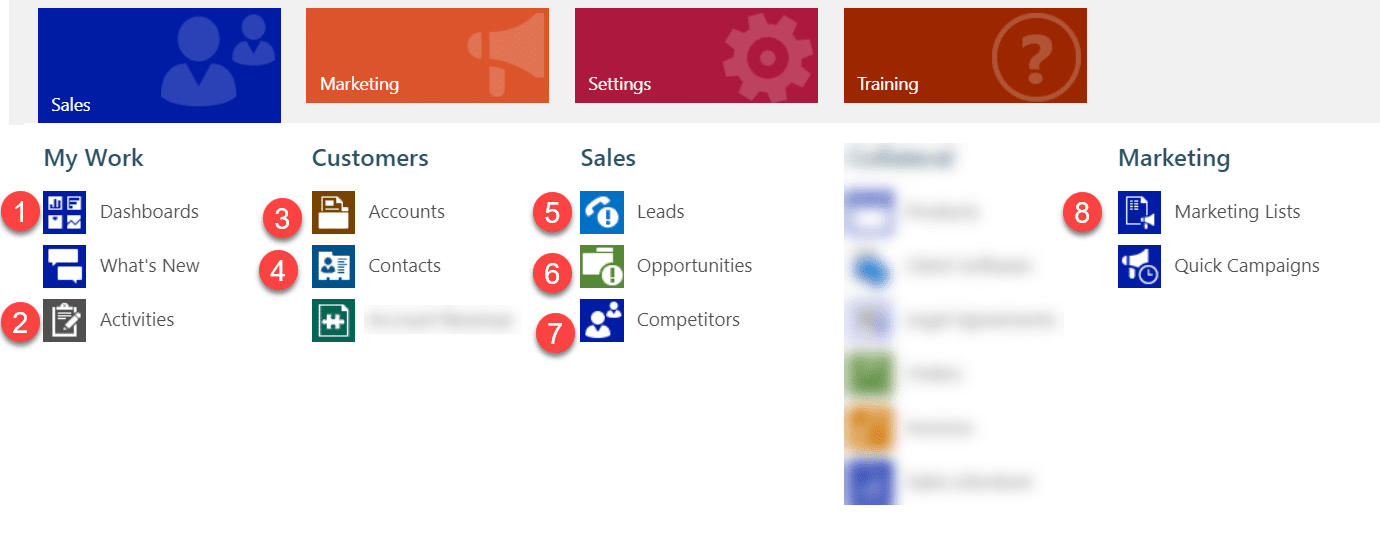
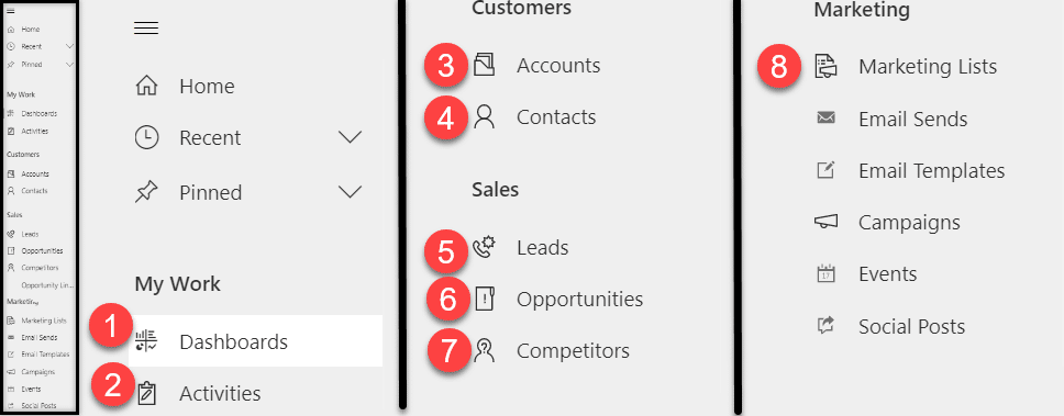
The navigation bar has gone through changes. Each of the icons highlighted with a number will be shown in the CI and UI, and you can follow where the location of each entity appears on the sitemap.
First, the navigation has changed from being horizontal and drops down from the navigation bar to appear on the left side of the screen. This reduces having to open and close the site map and keeps it fixed to the screen.
Second, within each app, every user can see the contents of the app. As seen below, there are examples of sensitive entities that only certain users can see in the Sales App. Every user can see these entities, but they are not able to access them despite appearing for everyone. In the UI, each of the necessary entities for a general user to see in the sales app no longer sees any sensitive entities, but instead only sees what they need to see for their role.
Lastly, the CI colors differentiating apps and entities is not a very clean format for viewing and can be customized for each entity. In the UI, the color scheme is consistent throughout in a modern gray and black, and entities are differentiated by the icon.
Classic Interface
Unified Interface
(in the screenshot, the navigation displayed to the left in full, while it is split into three sections for easier visibility to the right)
Changes with Recent and Pinned Records and Views
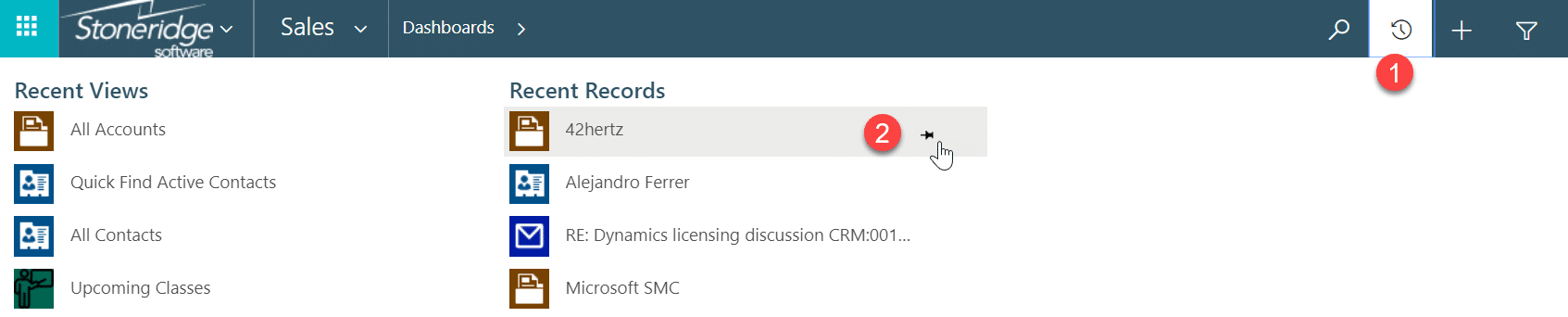
Accessing recent records in the new navigation comes with a more intuitive interface as well. The recent and pinned icon is no longer on the navigation bar in the top of the CI, but in the left-hand navigation of the UI.
1. In the CI, in order to access recent records and views, you would need to click on the icon on the navigation bar to view them, which then brings up the below navigation that covers up the record you are viewing. It segments the views and records, that you see, but puts all recent views and records on the same screen.
2. Second, you would pin records and views by clicking on them in the recent tab. The pinned records would appear on the same list as recent records and would take the place of other recent records you view, creating one list of records.
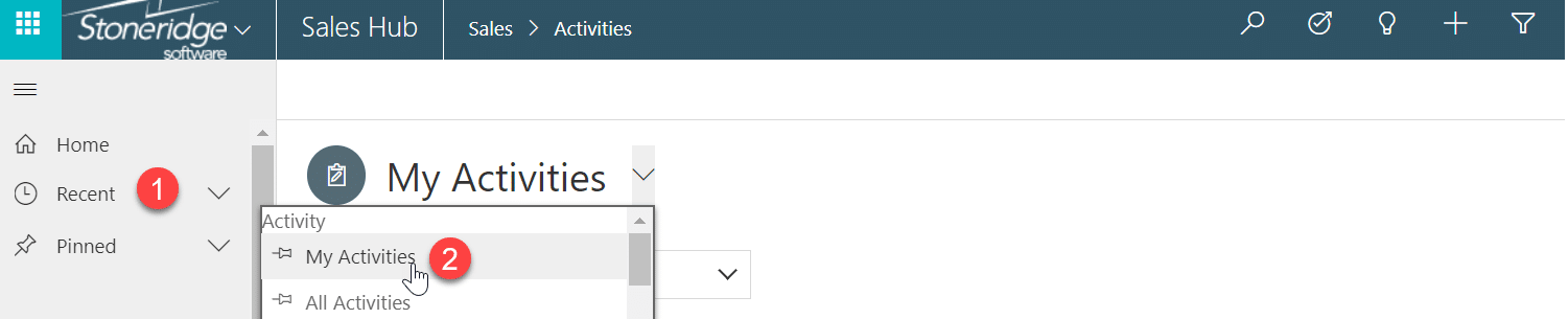
1. In the UI now there is label next to the recent logo in the left-hand navigation, and recent and pinned records no longer share an icon. Clicking the arrow will show you the most recent records you have accessed or any pinned records you have. In the UI, views, and records both show up under the same recent location. Likewise, pinned records and views both show up under the pinned tab.
2. In the UI, you must still pin recent records and views in recent, however, they will appear under “Pinned,” which segments the data in a more visually appealing way that does not cover the record you are viewing. Additionally, you are now able to pin views right in the view selector to select your default view and pin multiple views to be brought to the top of the list of views.
Reach out to our team at any time for advice on how to get the benefits of this upgrade to your solution!

Under the terms of this license, you are authorized to share and redistribute the content across various mediums, subject to adherence to the specified conditions: you must provide proper attribution to Stoneridge as the original creator in a manner that does not imply their endorsement of your use, the material is to be utilized solely for non-commercial purposes, and alterations, modifications, or derivative works based on the original material are strictly prohibited.
Responsibility rests with the licensee to ensure that their use of the material does not violate any other rights.